

Eight Shopify Stores Running Shoppable Video, and How Each Uses It
Most shoppable video articles show mockups. These eight are live Shopify storefronts you can open right now, with the screenshots taken from the sites themselves.

On this page
Key takeaways
- Eight live Shopify storefronts, in fashion, fabrics, fragrance, skincare and baby care, each running a shoppable video widget you can open and scroll today.
- Placement follows the buying question: homepage rails answer "what is this brand", product page rails answer "what does this item actually look like".
- Product tags with a visible price are what separate a shoppable rail from an Instagram embed, and every store here uses them.
- Start with five to eight videos rather than a full library, because an empty-looking rail costs more trust than no rail at all.
Most articles about shoppable video on Shopify illustrate the idea with a mockup. This one does not. All eight stores below are live Shopify storefronts running a shoppable video widget at the time of writing, and every screenshot was taken from the site itself. Open any of them, scroll, and you will see the same thing with whatever they have published since.
What is worth studying is not that they all installed a video app. It is where each one put the widget, and what question that placement answers for a shopper.
How these were captured
Each screenshot was taken from the public storefront at a 1440 pixel desktop width, with no editing beyond cropping to the widget. The products, prices and videos belong to the merchants. Nothing here is a rendering of what the app could look like.
Arippula: a homepage rail where every video is a product
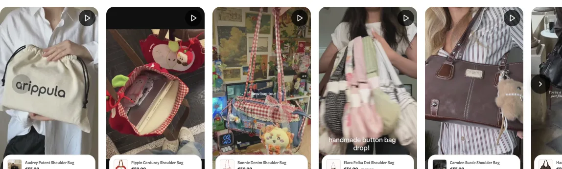
Arippula sells handmade shoulder bags in Europe. Their homepage carries a horizontal rail of vertical videos, and each one has a product card pinned to the bottom with the item name and price in euros.
That card is the whole difference between this and an Instagram feed embed. A shopper who likes the corduroy bag in the third video does not have to remember the name, open the catalogue and search for it. The bag is named, priced and one tap from the cart, inside the video they were already watching.
The videos themselves are mostly customer footage and casual filming rather than studio work, which suits the product. A handmade bag is bought on texture and scale, and a clip of someone carrying one down a street answers both questions faster than a white-background photograph.
Arippula again, on the product page
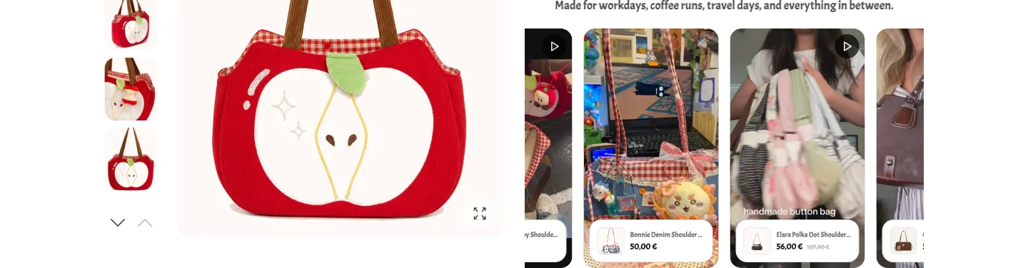
The same store runs a second placement on individual product pages, beside the gallery. This is a different job. By the time a shopper is on a product page they have already decided they are interested; what they want now is reassurance about the specific item.
Placing the rail level with the gallery means the shopper can move from the studio photograph to real footage without scrolling away from the buy button. It is a small thing that removes a common failure: video placed at the very bottom of a product page, below the reviews, where most shoppers never reach.
Choosing a placement
- Homepage below the hero, when the job is to explain the brand
- Product page beside the gallery, when the job is to reassure about one item
- Collection page, when the catalogue is visual and browsing is the main behaviour
- Avoid the very bottom of a product page, where scroll depth drops off sharply
Decize: product cards with live pricing on every reel
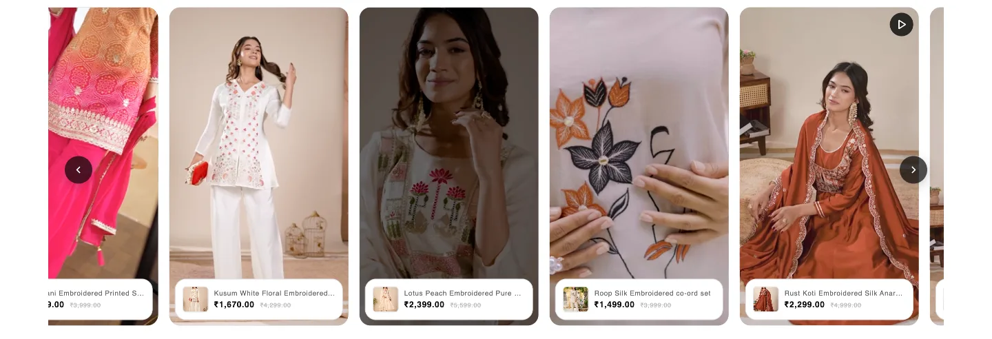
Decize sells women's ethnic wear in India. Their rail is the most commercially direct of the eight: every video carries a product card with the current price and, where a discount applies, the original price struck through.
This matters for a category where price and fabric are decided together. A shopper watching an embroidered co-ord move on camera can see it is 1,499 rupees reduced from 3,999 without leaving the video. The apparel category has a well-known problem of shoppers loving a look on social media and never finding the item on the site; a priced tag inside the video closes that gap.
Note also that the videos are shot vertically and framed tightly on the garment. Wide lifestyle footage looks good on a billboard and reads as nothing on a 300 pixel wide tile.
Moodzee: coverflow, when the brand is the product
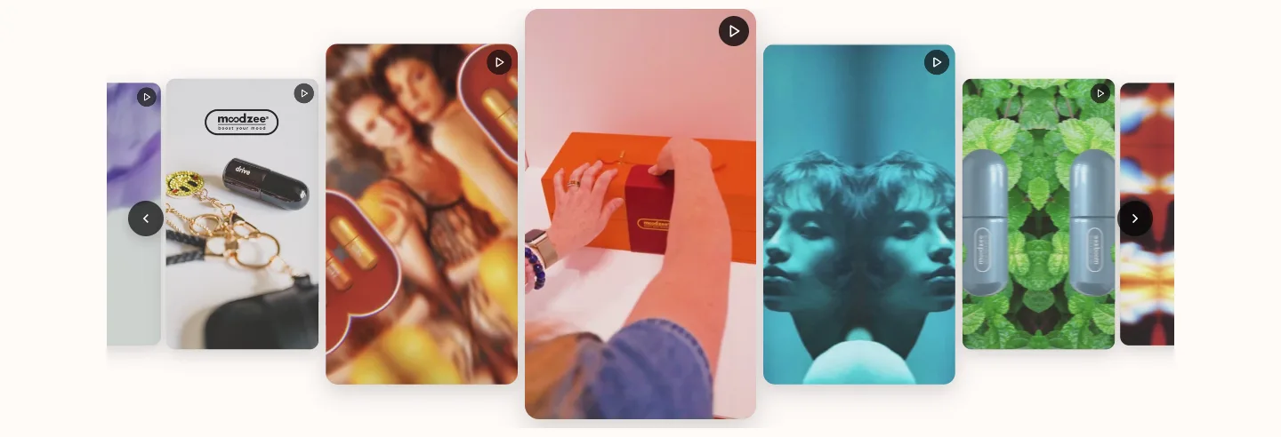
Moodzee sells fragrance and lifestyle products, and uses a coverflow layout rather than a flat carousel: the centre video is enlarged and the ones either side recede.
Coverflow suits a brand where the video is doing brand work rather than catalogue work. Unboxing footage, colour, mood. Fragrance cannot be demonstrated the way a bag can be, so the video is selling a feeling and the layout gives the centre clip enough room to carry it.
The trade-off is that a coverflow shows fewer products per screen than a flat grid. If your goal is catalogue coverage, use the grid; if it is brand impression, coverflow earns its space.
Ramji Sons: close-ups a photograph cannot replace
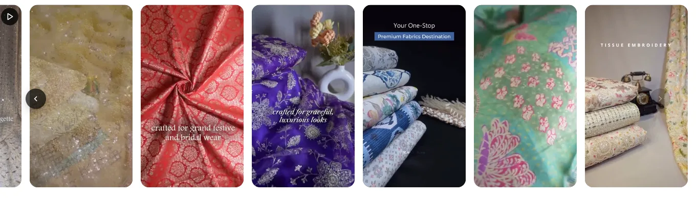
Ramji Sons sells premium fabrics. Their rail is almost entirely close-up footage: georgette catching light, a bandhani dupatta being unfolded, tissue embroidery under a lamp.
Fabric is the clearest case for video in commerce. A still photograph of georgette and a still photograph of a cheaper synthetic look nearly identical. Ten seconds of the fabric moving does not. The drape, the weight, the way light travels across it are all things a shopper would check by hand in a shop, and video is the closest available substitute.
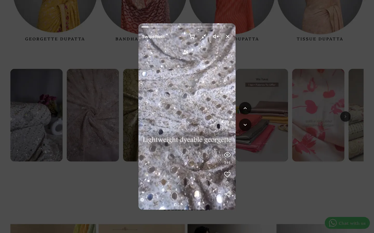
Tapping a tile opens a full player over the page rather than sending the shopper elsewhere. The vertical format, the swipe to the next video and the counters make the interaction familiar to anyone who uses Reels or TikTok, which is the point: the behaviour is already learned, so nothing has to be explained.
Mayskin: creators and product shots in one rail

Mayskin sells skincare in India and runs its rail full-bleed, edge to edge, high enough on the homepage to be the first thing after the header on most screens.
What is worth copying is the mix. Creator clips of people talking to camera sit next to plain shots of the tubes turning slowly against a coloured background. Skincare is bought on two things at once, whether the product works and whether you believe the person telling you it does, and one rail carries both when you alternate them.
There are no product cards on these tiles. That is a legitimate choice for a small catalogue where the rail is doing brand work and the shop link is a tap away, but it does mean a shopper who wants the green tube has to go and find it. If the catalogue grows, tags are the obvious next step.
Minbie: framing the rail so it reads as evidence

Minbie sells baby bottles, breast pumps and sterilisers in Australia, and gives the videos the most considered framing of the eight. An eyebrow reads "See Minbie in action". Below it a heading asks why parents choose Minbie, and a line of copy explains what the shopper is about to watch.
Only then do the videos start, and they are real parents in real kitchens with bottles and pumps rather than a studio setup.
The framing is doing as much work as the footage. Baby feeding is a high-anxiety purchase, and an unlabelled row of clips is decoration, while the same row under a heading that names its purpose is evidence. If you take one thing from this article, take this: tell the shopper what they are looking at and why, in the words they would use themselves.
Insane Look: customer content as the social proof
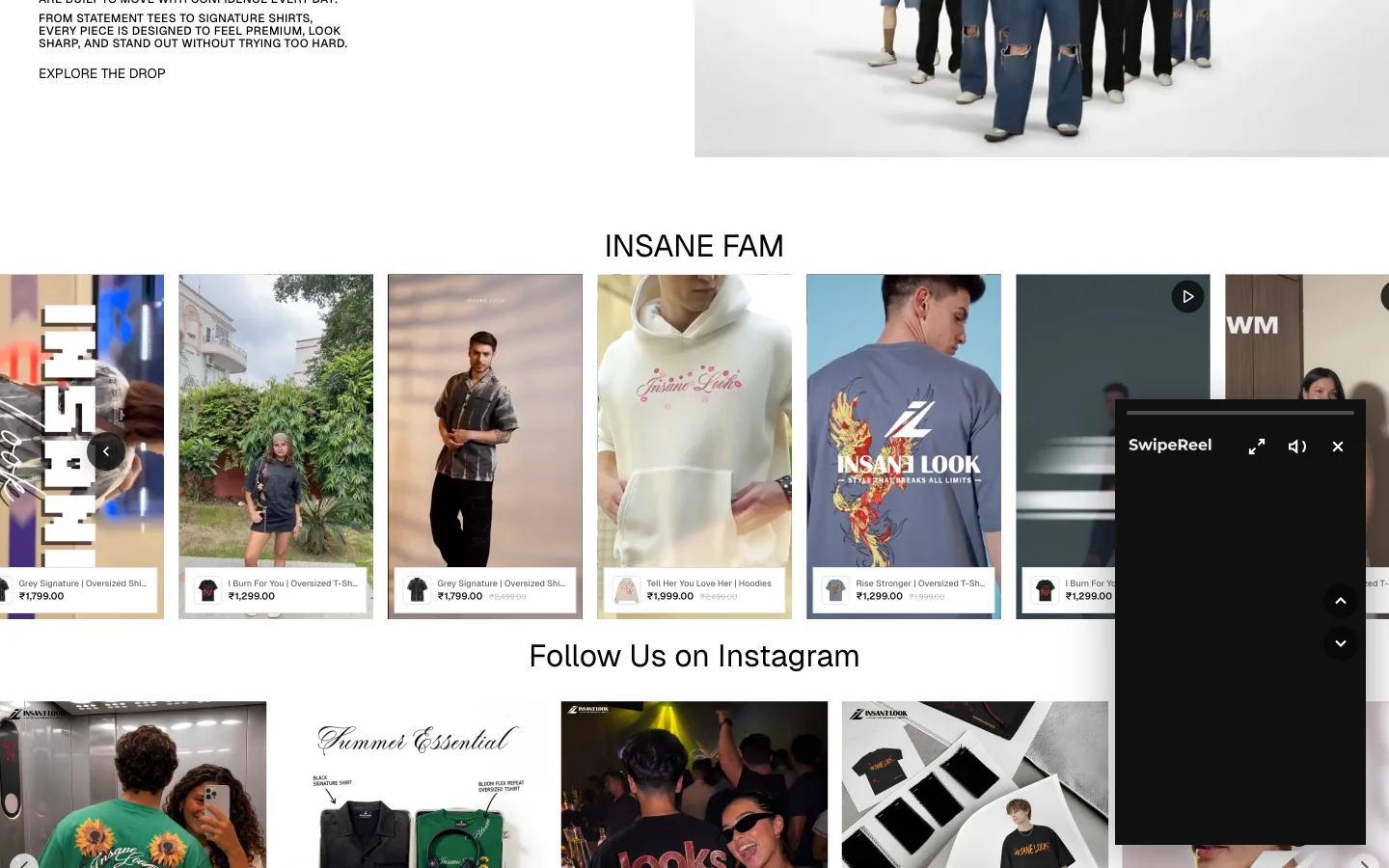
Insane Look sells streetwear in India and labels its rail "Insane Fam". The framing is deliberate. These are customers wearing the clothes, not models, and the section is named so that shoppers read it that way.
Each tile still carries a product card with the item and price, so the social proof and the catalogue are the same surface. A shopper convinced by seeing an oversized shirt on someone their own build can act on it without a second navigation step.
The store also runs a mini player, which continues the video in a corner while the shopper scrolls on. Whether that helps depends on your audience; it keeps the video alive during browsing, at the cost of some screen space on mobile.
What each placement is good at
| Store | Placement | The job it does |
|---|---|---|
| Arippula | Homepage rail | Introduces the range with prices attached |
| Mayskin | Full-bleed homepage rail | Mixes creator faces with product texture |
| Minbie | Headed homepage section | Frames the clips as evidence, not decoration |
| Arippula | Product page rail | Reassures about one specific item |
| Decize | Homepage rail | Puts price and discount inside the video |
| Moodzee | Coverflow | Carries brand feeling rather than catalogue |
| Ramji Sons | Homepage rail | Shows material qualities a photo cannot |
| Insane Look | Named customer rail | Frames the videos as social proof |
One more pattern worth noting: none of these stores replaced their product photography with video. The rail sits alongside the gallery, the collection grid and the existing imagery. Video answers questions photographs are bad at, and photographs answer questions video is bad at, such as showing an exact colour on a plain background. Treating the two as complements rather than a replacement is what keeps a product page readable.
What all eight have in common
Three things repeat across every store here, and they are worth copying before anything else.
Every video carries a product tag with a price. Without it the rail is decoration; with it the rail is a shelf. This is the single largest difference between a shoppable widget and an embedded social feed, and it is why an Instagram embed rarely moves revenue.
Every rail has enough videos to look full. Five to eight is the practical minimum for a carousel at desktop width. A rail with two tiles and a lot of empty space reads as neglected, and a neglected section costs more trust than an absent one.
Every video is vertical and tightly framed. These tiles are roughly 200 to 300 pixels wide in a browser and narrower on a phone. Footage framed for a wide screen loses its subject at that size, which is why repurposed Reels and TikToks work better here than trimmed landscape video.
Before you publish your rail
Open your own storefront on a phone, not just a desktop browser. Most storefront traffic is mobile, tile sizes shrink, and a product card that reads cleanly at 1440 pixels can become unreadable at 390. Check the price is still legible before you call it done.
Why real examples beat a feature list
There is a reason merchants ask for examples before they ask for features. A feature list tells you a widget supports product tagging; an example tells you what product tagging looks like on a store selling the same kind of thing you sell, at the size your images actually render.
The eight stores here span six categories on purpose. Bags and streetwear are visual and impulse-led, where a video does the work a photograph cannot quite manage. Fabric is technical, where the shopper is checking a material property. Fragrance cannot be shown at all, so the video sells an atmosphere instead. Skincare rests on whether you trust the person holding the tube, and baby care on whether another parent got it to work. If your catalogue sits in one of those groups, the store nearest to yours is the one to copy first.
The second reason is trust. Every claim in a marketing page is a claim until a shopper can check it. A list of storefront links is checkable in ten seconds, and a merchant deciding whether to install an app is exactly the kind of person who will check.
Where to start
If you are adding shoppable video for the first time, the pattern across these eight stores suggests a simple order. Collect five to eight vertical clips you already have, from Instagram, TikTok or customers who have given permission. Tag each one to a product so the price is visible. Place the first rail on the homepage below the hero, where it explains the brand. Then, once that is live and you can see what people tap, add a second rail on your best-selling product page.
More on the mechanics in our guides to adding shoppable video to Shopify, turning Instagram Reels into store content and collecting UGC worth publishing. If you are weighing apps, the free shoppable video options piece covers what the free tiers actually include.
None of these merchants was asked to write anything for this article. The screenshots are of their public storefronts, and if any of them would rather not appear here, we will take the section down on request.
Frequently asked questions
- Are these screenshots real or mockups?
- Every image in this article was captured from the live storefront on the date of writing, at a 1440 pixel desktop width. The products, prices and videos belong to those merchants.
- Where should a shoppable video widget go on a Shopify store?
- It depends on the question the shopper is asking at that point.
- How many videos do I need before adding a widget?
- Five to eight is enough to fill a carousel without visible gaps.
- Do shoppable videos slow down a Shopify store?
- They can, if the app loads every video file up front. A widget that lazy loads, so it fetches nothing until the shopper scrolls to it, keeps the page render unaffected.
- What makes a video shoppable rather than just embedded?
- A product tag that carries the product and its price, and a path to the cart without leaving the video.
- Can I use customer videos instead of studio content?
- Yes, and several of the stores here do. Customer footage tends to answer questions studio photography avoids, such as how a bag sits on a real shoulder or how a fabric moves.
- Do these stores pay for the app?
- Six of the eight are on a paid plan and two are on the free plan.